Wisdom Keepers
Branding
Background
Located in the Bronx, New York City, Wisdom Keepers are a new grassroots movement that will seek elders despite their age, to volunteer their time and wisdom to make them feel like a hero to the community as well. They believe that wisdom can not be taught, but must be shared with the community and combat food insecurity.
Objective
The main goal was to create a visual brand for the new initiative, first and foremost a logo that would be recognizable to the targeted audience, as well as any material that would further promote Wisdom Keepers. The experience we want the audience to have is to feel inclined to donate their time, resources, and knowledge to others that are less fortunate.
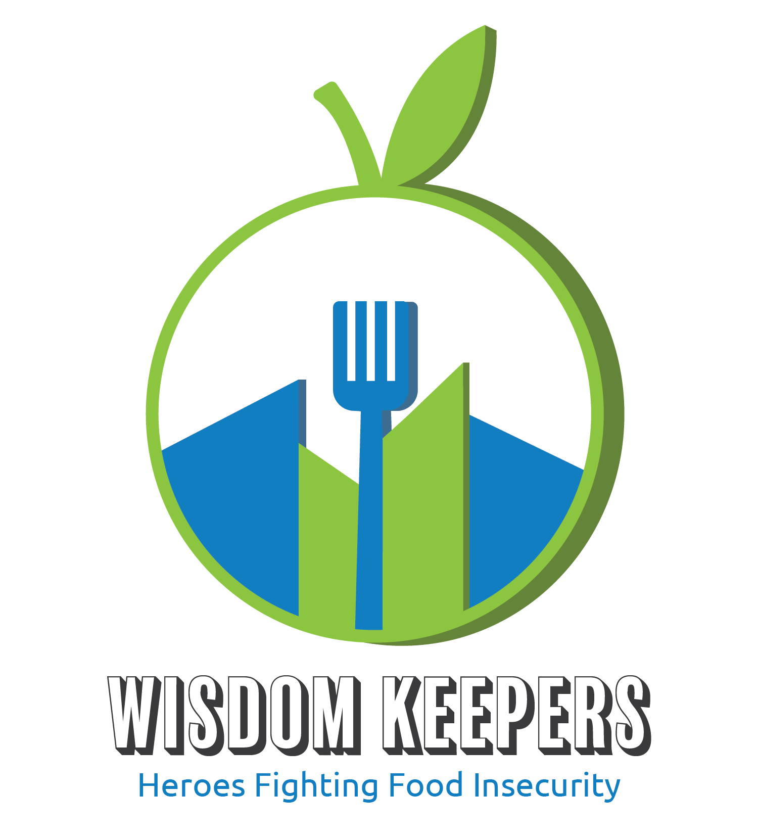
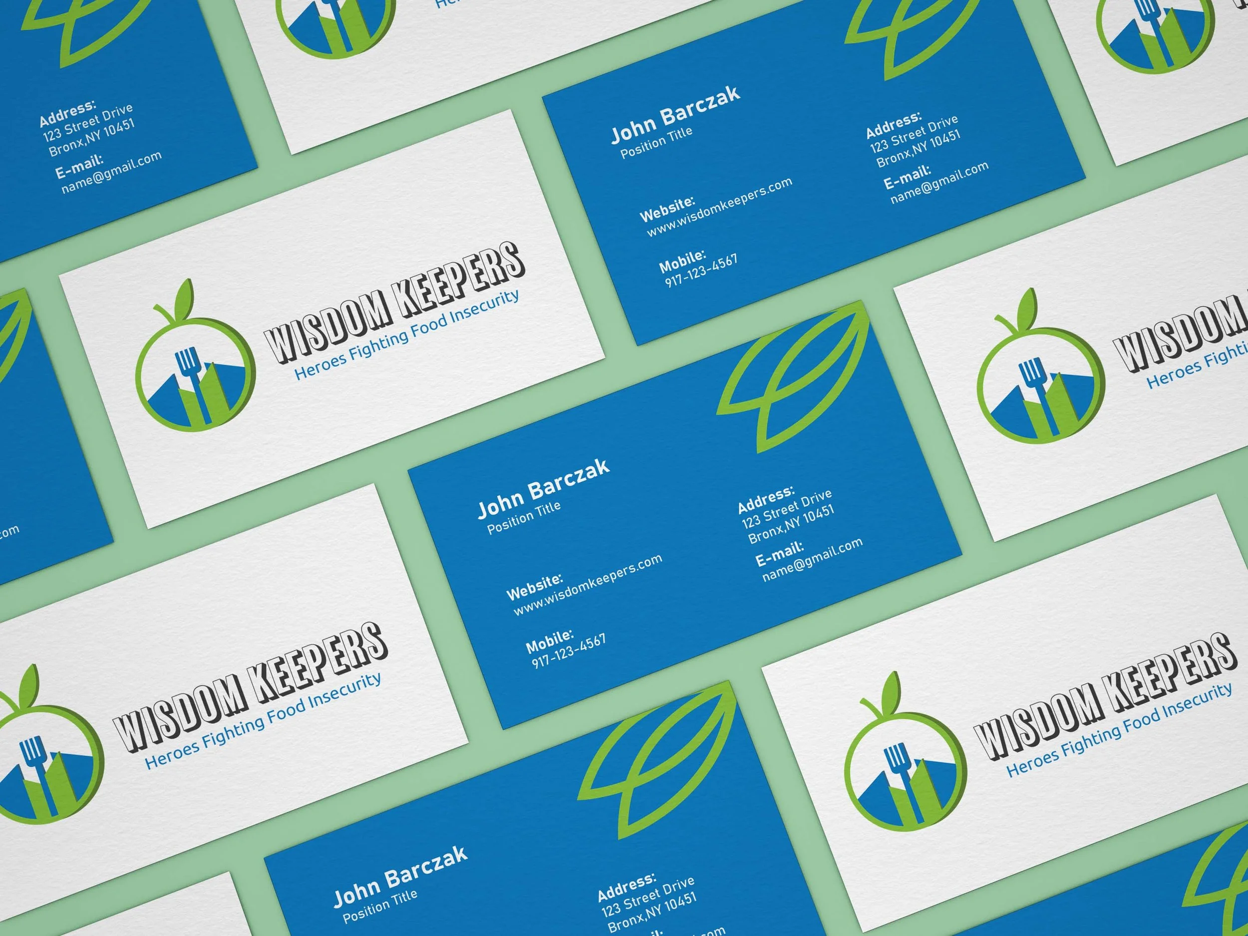
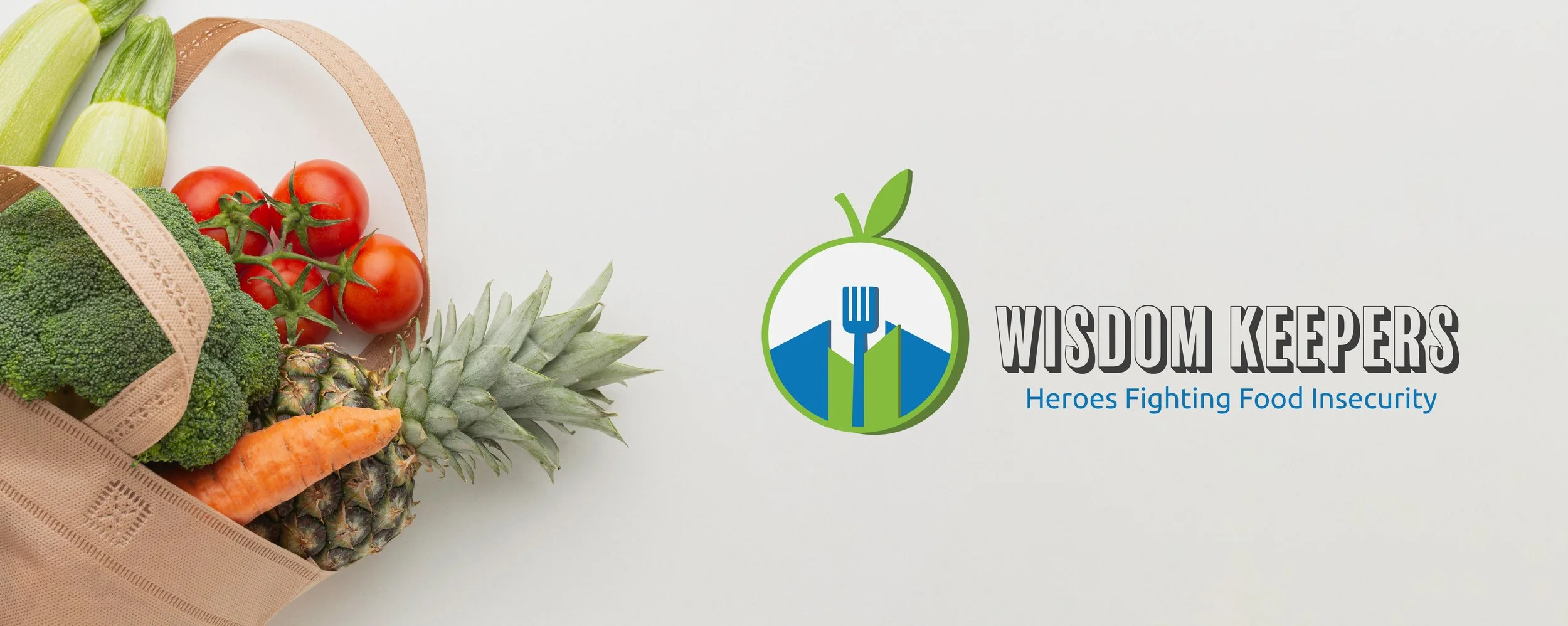
LOGO
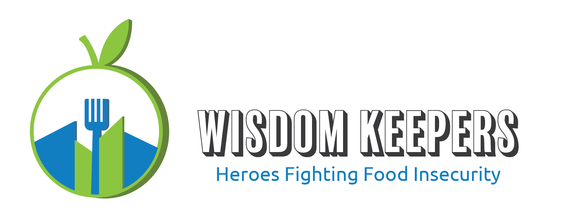
The logo depicts a combination of an apple, fork, and buildings. The apple represents wisdom, the buildings represent urban, and the fork represents food. The Wisdom Keepers wanted to emphasize these three characteristics based on where they are from, what they stand for and what they represent. The apple holds everything in also coveying inclusiveness. For the typeface, Balboa Primary was used, in order to keep it legible for the target audience, the elders.