Doctors Without Borders
Rebranding
Background
Doctors Without Borders, also known as Medecins Sans Frontieres was founded in 1971 by Max Recamier and Bernard Kouchner. They were initially in the International Committee of the Red Cross and decided to make their own organization to save other lives that the Red Cross could not reach out to which eventually led to creating an organization of humanitarianism. Doctors Without Borders was created on the belief that all people have the right to medical care regardless of gender, race, religion, creed, or political affiliation.
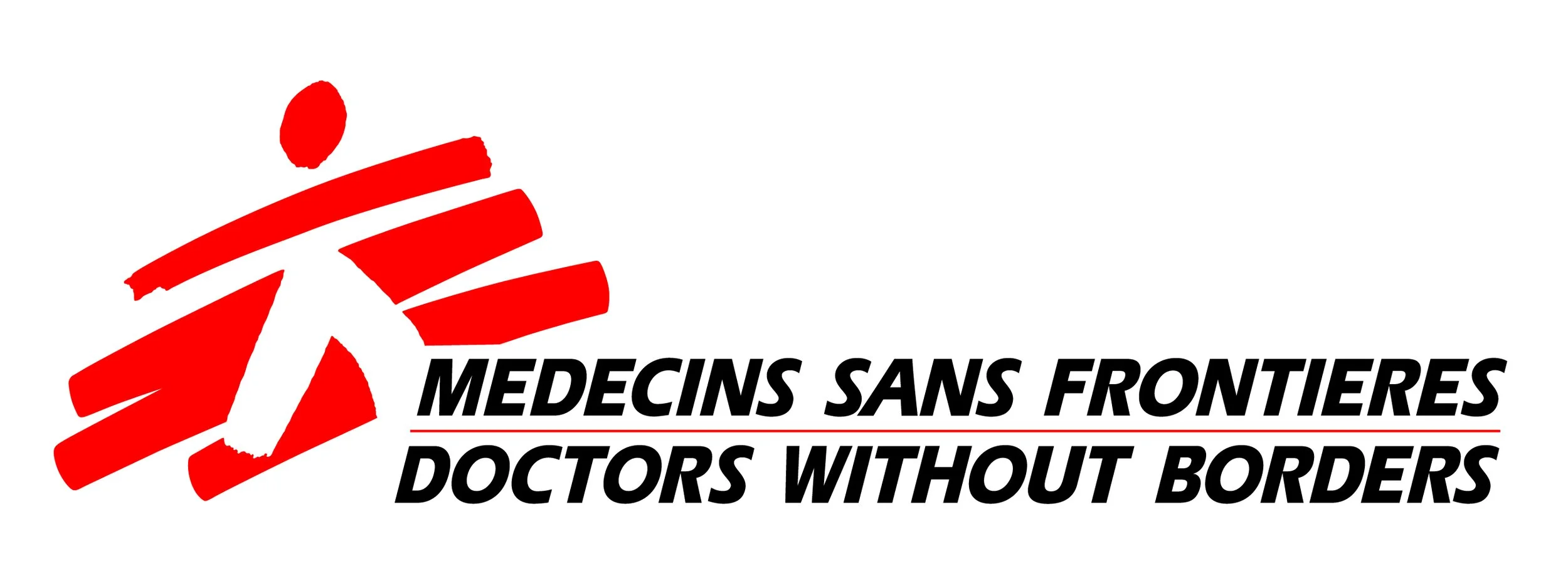
Original Logo
New Logo

Overview
The objective of this project was to rebrand a non-profit organization, Doctors Without Borders, and the goal for the new logo is to be easily recognized and spread more awareness about the issues they are fighting against in hopes of gaining more supporters. The target audience for this organization is anyone around the world who believes in human rights and is willing to donate or lend a helping hand, whether it’s a journalist, nurse, or doctor.


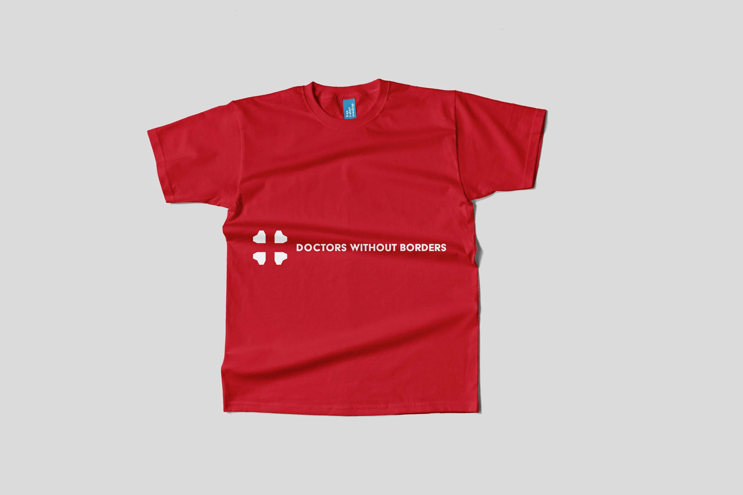
Logo
The redesigned logo can be mainly recognized as a pictorial mark logo because of the way it is combined with two pictorial images, a cross, and a heart. This results in geometrical hearts creating a cross with negative spaces. It is also figurative because the cross represents hospitals and doctors while the heart represents passion and love.